

Some guides are easy to follow. You can tell what each section is about at a glance. The steps are clear, and the visuals support what’s being explained. Others are harder to follow, even if the information is useful. You find yourself rereading, scrolling back, or dropping it altogether.
Clarity doesn’t just come from what you write but how you present it. Formatting choices like spacing, hierarchy, and visual structure can make a big difference in how someone experiences a guide.
This article shares simple ways to make your guides easier to follow by focusing on structure, flow, and visual clarity. You’ll see how small adjustments in how you present information can help improve the reading experience for your reader.
Why formatting and visuals matter more than you think

Image source: Freepik
People don’t always read guides from start to finish. Most of the time, they scan the page first. They look for headings, steps, or anything that helps them quickly understand what to do.
Ensuring your content is well-formatted and has supporting visuals helps users process and retain information faster. These help break the content into smaller parts, highlight what’s important, and show what to focus on. This makes the guide easier to read, easier to follow, and less overwhelming.
It also builds trust in the guide’s credibility. When things look neat and organized, readers feel like the writer knows what they’re doing. But if the layout is messy, it becomes harder to keep reading.
Good formatting also supports different kinds of readers. Some people find it easier to focus when there’s enough space between lines or when steps are numbered. Others might rely on screen readers and need a clear structure to move through the content. So, good formatting is necessary to help more people use and understand your guide.
Formatting basics that instantly improve clarity
Ensuring clarity in your writing is easier when the layout supports it. A few simple formatting choices can help your content feel clearer and more organized.
Here are some basics that can help:
a) Use clear headings:
Headings break your content into sections so readers can quickly find what they need. Use a proper heading hierarchy to show structure.
- The title should be the main heading H1
- Subsections under it should be H2
- Smaller points inside those can be H3
This helps both people and screen readers understand how the content is organized.

This is an example showing how an article is organized in the table of contents based on the heading hierarchy.
b) Keep paragraphs short:
Long blocks of text are hard to read. Aim for 2–4 lines per paragraph.
c) Add white space
Don’t pack everything too close together. Leave enough space between sections, steps, or ideas so the page feels breathable. This helps people focus without feeling overwhelmed.
d) Highlight key text
Use bold to call attention to important actions or terms, and italics for extra notes or soft emphasis. But don’t overdo it. If everything is bold, nothing stands out.
For example, click the Save Changes button before you exit.
e) Use lists for structure
- Use numbered lists for steps that must be done in order.
Example: 1. Open the app → 2. Tap “Create Account” → 3. Enter your email. - Use bulleted lists for ideas or options that don’t need to be in order.
These choices improve scannability and help readers stay oriented.
Adding visual support where it’s needed
Visuals can make a guide easier to understand if they’re used with care. When placed well, they can show what words can’t explain clearly on their own. But if there are too many, too large, or out of place, they can pull attention away from what matters.
Here are a few types of visuals that help when used with purpose:
a) Screenshots
These work well for showing what a user should click, select, or expect to see. Keep them focused; crop out extra space, blur personal data, and highlight only what matters.
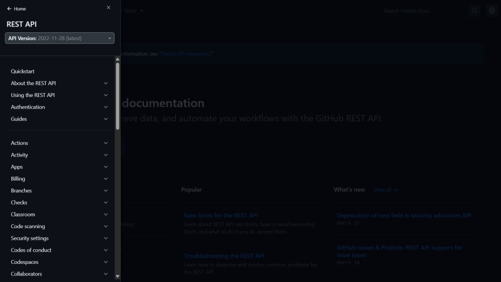
Image source: GitHub REST API documentation
This is an example of a screenshot of the GitHub REST API documentation page showing the user the table of contents for easy navigation.
b) GIFs or short screen recordings
These can show short actions, like dragging a file or filling a form. Use them for small interactions so they stay quick and light.
c) Diagrams and flowcharts
This is helpful when you’re explaining how different steps or ideas connect.

Image source: Udemy
d) Icons and small visuals
These can help readers quickly spot tips, notes, or warnings. Use the same icon for the same purpose to build visual patterns.
e) Callout boxes
These help separate extra notes, examples, or reminders from the main steps. They give the page structure and make it easier to scan.

The screenshot above, taken from the Mautic user documentation, shows how a callout is used effectively with a callout at the bottom on installing Mautic using DDEV.
Each visual should support the content, not repeat it or compete with it. If you’re adding an image or GIF, ask yourself if it makes the step clearer or if it is just filling space. If it’s not adding clarity, it’s okay to leave it out.
Common mistakes to avoid
Even with the best intentions, some formatting choices end up making a guide harder to follow. Here are some common mistakes and how to avoid them:
1. Too much text without breaks: Long blocks of text feel heavy. Readers may skip or skim through them. Break content into shorter paragraphs and use bullets or headings to help the reader navigate.
2. Inconsistent formatting: Switching between fonts, heading sizes, or styles (like using bold in one place and italics in another) can confuse readers. Pick a style and stick to it throughout the guide.
3. Low-quality or unclear visuals: Blurry screenshots, images with too much detail, or visuals that don’t match the text can cause more confusion. Every image should be sharp and directly related to what’s being explained.
4. Overusing visuals: Too many images or GIFs can crowd the page and distract from the actual content. Use visuals to add clarity and not just for decoration.
5. Forgetting mobile readers: Some guides look fine on large screens but break down on phones. Use layouts and visuals that adjust well on smaller screens. Keep text readable and avoid wide images that don’t resize well or are truncated on smaller screens.
6. Not testing your guide: After writing, go through it like a new user would. Does the order make sense? Is anything unclear? This step helps catch issues that aren’t obvious while writing.
Avoiding these mistakes makes your guide easier to follow. Small changes in layout, style, and spacing often make the biggest difference.
If you need more tips on writing an amazing guide, check out our article, What Makes a Great How-to Guide?
Tools that make formatting and creating visuals easier

Image source: Freepik
You don’t need a complicated setup or expensive software to format your guide well. Here are some tools that make formatting and visuals easier to manage:
a) Writing and formatting platforms: Tools like Notion, Google Docs, and Markdown editors help you structure your content with headings, bullet points, callouts, and code blocks. They’re great for quick drafts and early layout planning.
b) Screenshot and annotation tools: CleanShot X, Snagit, or even Mac’s built-in screenshot editor (if you use one) let you grab clean images and add arrows, boxes, or highlights to explain what’s on screen. If you’re working with product tutorials, this saves a lot of time.
c) Design and layout tools: Use tools like Canva or Figma to design simple diagrams or visuals. They’re especially useful when you want to break down a concept visually or explain how different parts connect.
d) Documentation platforms: Platforms like Docusaurus or GitBook help you create full documentation websites. They come with built-in formatting options, clean navigation, and mobile-friendly layouts.
e) Accessibility checkers: Tools like Hemingway Editor or Microsoft Word’s accessibility checker can help you spot dense text, complex phrasing, or formatting issues before you publish.
If you’re not sure which tools to start with, we’ve written a full guide on choosing the right tools for your technical writing workflow. It walks you through what to look for based on your project.
Final thoughts
When your guide is easy to follow, readers stay with you. They don’t have to guess where to click next or reread a section just to make sense of it. Every heading, image, and sentence works together to make things clearer.
But that kind of clarity doesn’t happen by accident. It takes thoughtful structure, simple design, and a real focus on the person reading.
📢 At WriteTech Hub, we help tech teams turn complex ideas into guides people can actually follow because good documentation is designed to be understood.
✨ Looking for expert technical content? Explore our services or Contact us.
🤝 Want to grow as a technical writer? Join our community or Subscribe to our newsletter.
📲 Stay connected for insights and updates: LinkedIn | Twitter/X | Instagram

